

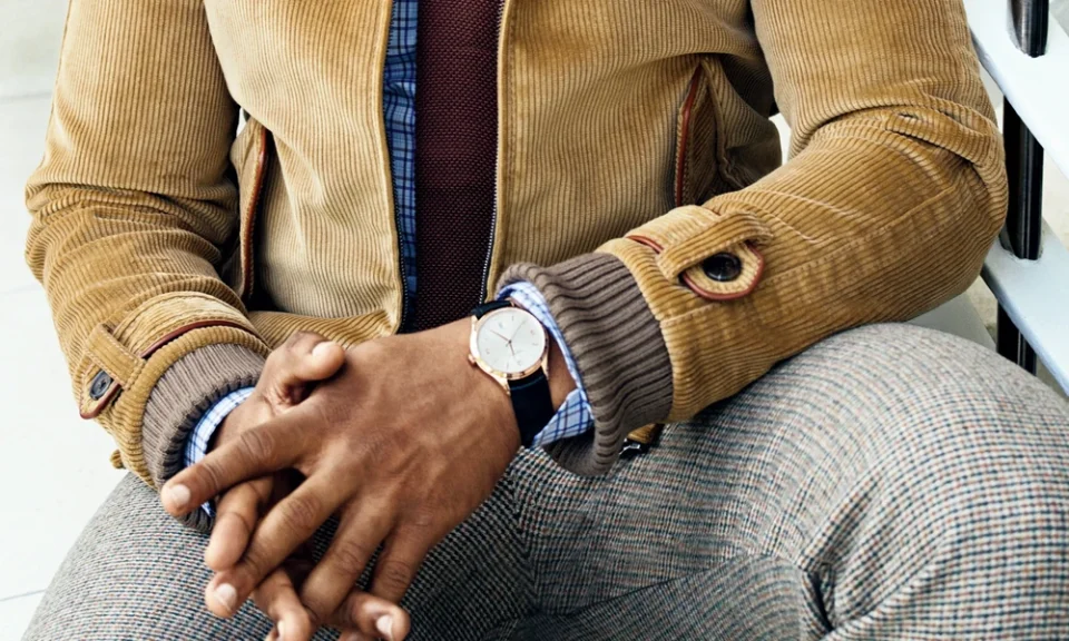
Colour is one of the first characteristics people notice about a watch, yet its influence extends far beyond appearance. The shade of a dial, case, bezel, strap, and even small details such as hands and hour markers can determine where a timepiece feels appropriate. Some combinations transition effortlessly between professional, social, and casual settings, while others create a stronger identity suited to particular outfits or occasions. Understanding how different colours behave can therefore make watch selection more intentional.
Dark Dials Create Visual Depth
Black, charcoal, and deep grey dials have a strong presence without necessarily appearing excessive. Their darker surfaces can create contrast against metallic hands and markers, giving the face greater visual depth.
Black dial Watches are particularly adaptable because darker tones can complement business clothing, denim, jackets, and evening attire without competing heavily with surrounding colours. Charcoal provides a slightly softer alternative, especially when combined with brushed steel rather than highly polished metal.
Dark dials can also make colourful details stand out more clearly. A small red hand or blue marker, for example, becomes noticeable without dominating the complete design.
Blue Offers More Range Than Expected
Blue has become an interesting option for men who want something less conventional than black without moving toward an extremely bold palette. However, different shades of blue create very different effects.
Navy can appear restrained enough for professional environments, while brighter royal or electric blue produces a much stronger visual statement. Sunburst blue dials can change character according to lighting, appearing almost black indoors and considerably brighter in direct sunlight.
This ability to shift visually gives blue considerable styling flexibility. It can complement grey tailoring during working hours and look equally natural with casual weekend clothing.
White And Silver Keep The Dial Visually Light
Lighter dials often create an entirely different impression. White, cream, and silver surfaces can make a watch feel open, crisp, and understated. They also provide a neutral foundation for different strap colours.
When it comes to traditional Mens Watches, a bright dial with a brown leather band can look warm and timeless, but the same face with a steel bracelet feels more modern. Changing only the strap can therefore alter the personality of the watch without changing its central design.
Cream and off-white shades can offer additional warmth and are especially effective when paired with gold-toned details or darker leather.
Case Colour Changes The Overall Character
The dial receives considerable attention, but case colour can be equally influential. Silver-toned stainless steel generally works easily with a wide range of clothing because of its neutral character. Gold tones create greater warmth and visibility, while black cases often introduce a sportier or more modern aesthetic.
Mixed metal designs offer another possibility. Combining warm and cool metallic tones can make it easier to coordinate a watch with different accessories, including rings, belt hardware, and cuff links.
Retail selections available through House of Watches illustrate how dramatically the overall impression of a timepiece can change when similar dial designs are paired with different case finishes and bracelet colours.
Strap Colour Can Redefine The Same Watch
A strap occupies significant visual space on the wrist, which means its colour has substantial influence over the watch as a whole. Black leather traditionally creates a sharper and more formal effect, while medium or dark brown leather can introduce warmth and make the watch feel more relaxed.
Fabric and rubber straps open the door to colours such as olive, navy, grey, burgundy, and even brighter shades. These options allow the wearer to introduce colour without committing to a permanently colourful dial or case.
This makes strap changes one of the simplest ways to increase versatility. A restrained watch can appear business-appropriate with leather and become considerably more casual when paired with fabric.
Accent Colours Allow Personality Without Dominating
Versatility does not require avoiding colour completely. Small accents can provide individuality while preserving flexibility. Coloured seconds hands, bezel markings, subdials, or stitching can introduce character in controlled amounts.
The key is visual balance. When one element carries a strong colour, keeping surrounding components more restrained prevents the design from becoming difficult to coordinate.
Ultimately, watch colour should support the situations in which the timepiece will actually be worn. Neutral shades maximise adaptability, while carefully chosen stronger colours create personality. By considering the dial, case, strap, and accents as one complete palette, men can choose timepieces that move comfortably across different outfits, seasons, and occasions.
